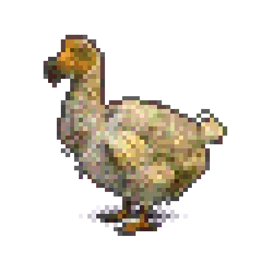
Dodo
Raphus cucullatus
- Range
- Mauritius
- Last seen
- 1662
A design system
for the baseline web.
A unified collection of web-native primitives, style utilities, and design tokens for no-build, low-build, and legacy projects.
4 species on your watch list
0of 4 confirmed
22 sightings logged, all pending review
0of 4 confirmed
Reviews are taking longer than usual
4of 4 confirmed
Last confirmed between 1662 and 1918
Raphus cucullatus
Choose what reaches your phone.
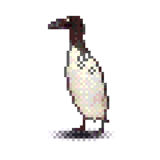
Pinguinus impennis
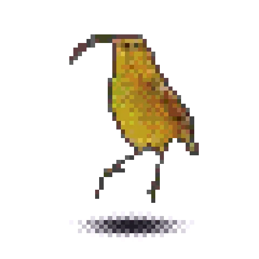
Akialoa ellisiana
Yours and the historical record, newest first.
| Location | Observer | Count | Status | ||
|---|---|---|---|---|---|
Raphus cucullatus | Backyard feeder | You | 1 | Pending review | |
Conuropsis carolinensis | Riverside park | You | 12 | Pending review | |
Pinguinus impennis | Ferry terminal | You | 2 | Pending review | |
Conuropsis carolinensis | Cincinnati, Ohio | Zoo staff | 1 | Confirmed | |
Pinguinus impennis | Eldey, Iceland | J. Brandsson | 2 | Confirmed | |
Akialoa ellisiana | Oʻahu, Hawaiʻi | F. Deppe | 1 | Confirmed | |
Raphus cucullatus | Île d'Ambre, Mauritius | V. Evertsz | 1 | Confirmed |

No sightings match.
Keep looking.
People on the record for your species.
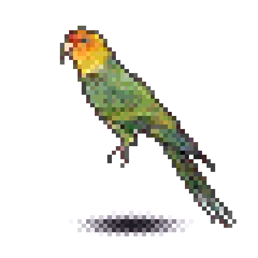
Conuropsis carolinensis